Columns
Within the Columns layout you will need to select how many columns you want to display and what type of content to use within those columns. Some combinations of columns content are not recommended. Follow specific instructions and options below.
One Column
For one column use either Text or Gallery content types only.
Text

- Choose background color or background image (and select or upload an image to the media library)
- Add a column with the red button and select Text as the content type.
- Enter all your content, header, body text, button, etc. here.
- Select background color (under the wysiwyg) to display behind the text.
Gallery

- Choose background color grey or white.
- Do NOT use the optional header or intro text wysiwyg.
- Add a column with the red button and select Galley as the content type.
- Use the red button to “Add Images” and select (or add new) from the media library.
- You MUST use images that are the same exact dimensions.
Two Column
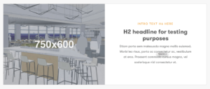

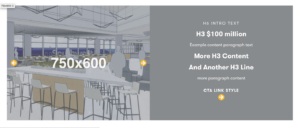
- For two column use a combination of Text/Image, Text/Video, or Text/Gallery content types only.
- Background recommendation for this block is white or grey.
- Add optional badge image if needed.
- Add a column with the red button and select desired content type for the left column. Then repeat for the right column.
- Text – Enter all your content, header, body text, button, etc. in the Text column.
- Image – Select (or upload new) image from the media library. Reference the Style Guide for the recommended size.
- Video – Enter the FULL url of the video from YouTube or Vimeo. (Do not use the shorted ‘share’ url.) It is strongly recommended that you use an image overlay with the video. Image size should match the recommendation for 2 column image.
- Galley – Use the red button to Add Images from the media library. You can also add new images there now.
- You MUST use images that are the same exact dimensions.
3 columns should be created using either Cards or Stacked Text/Image layout.
Newsletter Signup

You may want to clone an existing version of this page block and simply change the name and joining page, if any edits are needed. Or consider using a single instance of this block as a “Global” page block that would be the exact same throughout the site.
- Choose background color or Image and add image.
- Enter Text that supports the signup field.
- Select Text color depending on the darkness of the background.
- Insert the form short code:
Cards

- Background recommendation for this block is white or grey.
- Add 3 cards using the red Add Cards button.
- For each card enter:
- an icon/badge image
- color overlay option
- background image
- wysiwyg text
- url and display text for the button
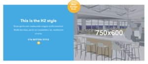
Floating Text

- Background recommendation for this block is an image. Reference the style guide for the proper dimensions for this background image.
- Enter wysiwyg text including any header, intro text, and buttons.
- Select color overlay to display behind the text.
Stacked Image/Text

- Background recommendation for this block is white or grey.
- Enter optional Header text that will display centered above the columns.
- Add 3 cards using the red Add Columns button.
- For each column enter:
- image
- wysiwyg text
- url and display text for the cta button